Most EdTech landing pages do not fail because the visual design is unappealing. They fail because the ad promise, the page message, the trust signals, and the counseling journey are entirely disconnected. Meta Ads might successfully win the click, but your landing page decides whether that click translates into a highly-qualified counseling conversation, a show-up, or just another wasted lead that frustrates your sales team. To drive down your Cost Per Enrollment (CPE), EdTech leaders must optimize for message match, apply core UX psychology to reduce cognitive load, and systematically pre-qualify leads before they ever hit the submit button.
The Leak Starts Before the Counselor Calls
If you are a founder, a marketing head, or a growth leader in the EdTech space, you have undoubtedly sat through a weekly revenue meeting and heard these exact complaints:
- “Leads aa rahe hain, but enrollments nahi aa rahe.”
- “CPL (Cost Per Lead) low hai, but counseling team bol rahi hai lead quality weak hai.”
- “Clicks aa rahe hain, but landing page form complete nahi ho raha.”
Most EdTech leaders panic and blame Meta Ads way too early. They immediately assume it is a targeting issue, complain about creative fatigue, or decide they need a new media buying agency.
But the real friction isn’t your ad targeting. It is your EdTech landing page.
A student sees an ad promising a structured career transition, a high-income skill, placement support, or a life-changing transformation. They click with high intent. Then, they land on a page that is generic, incredibly slow to load, overloaded with text, and completely disconnected from the emotional trigger of the ad they just clicked.
That single, jarring moment shatters trust.
In the EdTech industry, trust is the currency of conversion. You are not selling a $20 t-shirt; you are asking someone to invest significant money, months of their time, their career hopes, and often their family’s approval. A cheap click cannot carry that emotional and financial weight alone.
As CTO and Co-founder of UXGen Metalabs, I have spent years diagnosing complex funnel friction points. Today, we are going to break down exactly why your EdTech landing pages are suffocating your Meta Ads performance, how poor UX destroys your auction mechanics, and how to rebuild your ad-to-page journey so your campaigns drive revenue, not just vanity metrics.
Why EdTech Meta Ads Fail After the Click
A Meta ad is designed to create attention and interruption. But the landing page has to create belief and momentum.
In EdTech, the landing page is not a digital flyer. It is the critical, high-stakes bridge between idle curiosity and deep counseling intent. Most campaigns break down fundamentally because founders measure the funnel on the wrong metrics.
If you want executive-level growth, stop measuring weak metrics and start measuring business realities:
| Weak Measurement (Ads Manager Focus) | Better Business Measurement (Revenue Focus) |
|---|---|
| Cost per click (CPC) | Cost per qualified landing page visitor |
| Cost per lead (CPL) | Cost per counseling-worthy lead |
| Form submissions | Show-up rate and counselor connect rate |
| Lead volume | Lead-to-enrollment efficiency |
| CTR (Click-Through Rate) | Ad promise to page conversion quality |
| CPL | Cost per enrollment and enrollment ROAS |
Cheap leads look fantastic in your Ads Manager dashboard. But if your highly-paid expert counselors are spending six hours a day dialing low-intent students who do not even remember filling out the form, your real CPA is massive-it is just hidden in payroll costs and wasted operational time. A high form-fill rate with poor counseling intent is the definition of a broken funnel.
The Ultimate Conversion Killer: Ad Promise and Page Mismatch
This is where the majority of your budget burns.
Imagine your Meta ad clearly states:
“Stuck in a low-paying design job? Become a job-ready UX designer in 6 months.”
But the user clicks, and the landing page headline generically says:
“Welcome to our professional design course. Enroll for the 2026 Batch.”
That is a severe mismatch. The student clicked because of a specific, outcome-driven promise tied to their career pain point. The page immediately hit them with a generic institutional pitch. Now, the user has to work hard to figure out if they are actually in the right place.
This introduces massive cognitive load. When you force a user to think too hard to find the information they were promised, they will simply leave.
The Ad-Page Alignment Test
Your landing page needs to immediately answer these questions within the first viewport (before they even scroll):
- Did I land in the right place?
- Is this the exact same promise I clicked for?
- Is this program relevant to my current career stage?
- Can I trust this brand?
- What happens after I submit my details?
If the first screen cannot answer these questions clearly, the page is actively working against your Meta campaigns.
The Better Example:
- Ad Promise: “Move into UX with a structured career roadmap and placement assistance.”
- Landing Page Headline: “Move from a Confused Design Learner to a Job-Ready UX Practitioner with Our 6-Month Roadmap.”
Now the click has seamless continuity.
How Mismatch Penalizes You in the Meta Auction
Meta’s algorithm is smarter than we give it credit for. It monitors the post-click experience. If users click your ad and bounce off your landing page within three seconds because of a message mismatch, Meta registers a poor user experience. Your ad’s relevance diagnostics plummet, and Meta begins charging you higher CPMs (Cost Per Mille) to show that ad. You are literally paying a “bad UX tax” on every single impression.
Stop Selling the Syllabus Too Early
The prospective student is not always ready to buy the moment they land on your page.
Before they care about the intricacies of your curriculum, they need to believe:
- “Is this course right for my background?”
- “Will I actually get support when I’m stuck?”
- “What realistic financial result can I expect?”
Most EdTech pages jump straight into a massive, overwhelming feature dump: 40+ modules, Recorded classes, LMS access, Weekly Assignments, PDF downloads.
But the student’s real question isn’t about the quantity of modules. The real question is: “Will this help me move from where I am today to where I want to be tomorrow?”
Your landing page must sell the decision path before it sells the syllabus.
The Executive EdTech Landing Page Structure:
- Hero Promise: Confirm ad-message alignment immediately. Use high-contrast, minimalist aesthetics to draw the eye directly to the value proposition.
- Who This Is For: Improve lead quality by clearly stating who should (and shouldn’t) apply.
- Problem Framing: Build emotional relevance to their career plateau.
- Outcome Path: Show the logical, step-by-step transformation.
- Mentor Proof: Build authority and trust early.
- Curriculum Preview: Support rational evaluation (keep it brief and skimmable).
- Student Proof: Reduce financial risk with verified case evidence and alumni salaries.
- Counseling CTA: Move user to the next logical step.
- FAQ: Handle hidden objections regarding time, price, and eligibility.
UX Psychology: Form Friction and Pre-Qualification
Counseling teams are not magicians. If the landing page sends them unfiltered, low-intent leads, they will waste hours explaining basic program details to people who were never serious buyers.
A high-converting EdTech landing page pre-qualifies before the form submission. But you must balance qualification with UX laws.
Applying Hick’s Law to Lead Forms
Hick’s Law states that the time it takes to make a decision increases with the number and complexity of choices. If your EdTech landing page has a 15-field form asking for their graduation year, current salary, home address, and alternate phone number right out of the gate, you are violating Hick’s Law. You are creating decision paralysis.
Keep the primary form strictly to the essentials needed to initiate contact (Name, Email, WhatsApp Number).
How to Pre-Qualify Without Adding Form Fields:
Add qualification signals directly into the copy right before the Call to Action (CTA). Help the wrong audience self-filter by clearly stating:
- Program level: “Designed strictly for working professionals with 2+ years experience.”
- Time commitment: “Requires 10 hours of live weekend commitment.”
- Price expectation: “Premium 6-month certification (EMI options available).”
You do not need more leads. You need fewer, but significantly better, conversations.
Page Speed and Fitts’s Law: Mobile Revenue Protection
Many founders ignore mobile page speed and button placement because the page “looks fine” on their high-end desktop monitors. But over 90% of your Meta Ads traffic is mobile-first.
If your page loads slowly, the student leaves before seeing your offer. Google’s data shows that as load time goes from 1 to 10 seconds, bounce probability spikes by an astonishing 123%.
Furthermore, apply Fitts’s Law to your mobile design. Fitts’s Law dictates that the time required to move to a target area is a function of the distance to the target and the size of the target. Your CTA buttons on mobile must be large, high-contrast, and placed within the natural “thumb zone” at the bottom of the screen. If a user has to hunt for the button to book a counseling call, they won’t.
Speed and usability are not just UX details. They are pure media efficiency.
Aligning the Landing Page to the Campaign Stage
Not every Meta campaign should send users to the exact same landing page. A cold audience and a warm retargeting audience have completely different psychological needs.
| Campaign Stage | User Mindset | Landing Page Requirement |
|---|---|---|
| Cold Awareness | “What is this and why should I care?” | Problem framing, clear promise, deep trust building, outcome clarity. |
| Consideration | “Is this right for my specific career?” | Mentor proof, detailed career roadmap, specific alumni outcomes. |
| Retargeting | “Should I pull the trigger and apply?” | Objection handling, urgency, direct counseling CTA, ROI focus. |
| High Intent | “I am ready to speak to someone.” | Short form, direct booking calendar, WhatsApp integration. |
If you send cold traffic directly to a hard-sell application form, lead quality plummets. If you send hot retargeting traffic to a generic awareness page, you lose momentum and bore the prospect. Campaign architecture and landing page architecture must be built in tandem.
Why UXGen Metalabs Is Your Executive Performance Partner
At UXGen Metalabs, we are not built around getting you “cheap CPLs.” We don’t just launch ads and hope for the best. We specialize in Meta Campaign Audits & Performance Intelligence for EdTech brands that demand better lead quality, stronger counseling efficiency, and scalable, predictable enrollment economics.
Most performance marketing agencies only look inside the Ads Manager. They tweak audiences and duplicate ad sets endlessly. We look at the complete revenue path. Your Meta Ads are only as strong as the UX system receiving the traffic.
Realistic Case Study: Fixing a Broken EdTech Funnel
- Client Context: A premium tech upskilling platform was running Meta Ads for a career-focused course. The CPL looked great on paper, but the counseling connect rate was dismal. Leads did not remember the offer, and students were constantly confused about the course level. The founder wanted to scrap the campaign and completely change the ad targeting.
- Our Approach: We audited the full journey. We didn’t touch the targeting; we looked at the post-click experience. The real leak was message continuity and cognitive overload. We rebuilt the page around user intent: we added a clear “who this is for” section to repel bad fits, utilized a dark-mode, high-contrast aesthetic to highlight the primary CTA, shortened the massive curriculum dump, and added qualification copy right before the form. We also mapped the CRM directly to the Meta Conversions API (CAPI) to feed high-quality show-up data back to the algorithm.
- Measurable Outcome (Within a 28-Day Testing Window):
- Cost per qualified counseling call dropped by 41%.
- Qualified counseling call volume went up 2.3X.
- Lead-to-enrollment efficiency increased by 58%.
- The Insight: The client realized, “We were optimizing ads for clicks. UXGen Metalabs showed us our landing page was breaking student confidence before our counseling team even picked up the phone.”
We diagnose performance leaks and build a conversion system around real student decision-making psychology. We help you answer the questions that actually matter: Where is student intent dropping? Is the page attracting the wrong audience? Which specific campaign is driving real enrollment quality, not just cheap form fills?
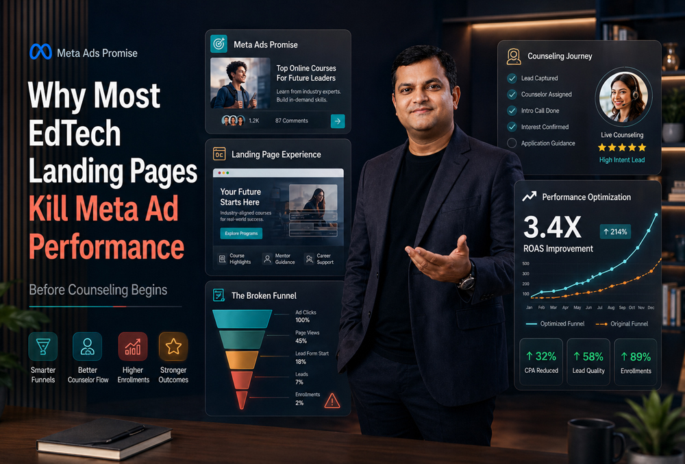
Visual Recommendations for Your Blog Layout
To maximize dwell time and make this highly skimmable for busy founders, include these visuals in the final layout:
- Ad-to-Landing Page Alignment Diagram: A flowchart showing Ad Promise → Landing Page Hero → Proof → Form → Counseling Call → Enrollment.
- EdTech Funnel Leak Map: A funnel graphic showing the drop-off between Clicks, Landing Page Views, Form Starts, Leads, Call Connects, Show-Ups, and Enrollments.
- Landing Page Scorecard Graphic: A visual representation of the 10 scoring areas with red, amber, and green status indicators.
Frequently Asked Questions (FAQs)
- Why are my EdTech Meta Ads getting leads but not enrollments?
Because lead volume and enrollment intent are two vastly different things. Your ads might be highly engaging and attract curious users, but if your landing page doesn’t qualify them-by explaining exactly who it’s for, the specific career outcome, and what happens after they apply-those leads will enter your CRM without any real buying intent.
- What is the best landing page structure for EdTech Meta Ads?
The most effective structure starts with an immediate ad-message match, followed by audience clarity, problem framing, the outcome path, mentor proof, a brief curriculum preview, student proof (case studies), and a clear counseling CTA. Do not start with a massive curriculum dump. Help the user understand if the program fits their goals first.
- Should EdTech brands use website landing pages or Meta Instant Forms (Lead Ads)?
Both can work, but they serve different strategic purposes. Meta Instant Forms are great for volume and drastically reduce friction. However, website landing pages usually give you significantly stronger control over the trust-building experience, advanced pixel tracking, and lead qualification. For high-ticket, premium EdTech programs, website forms generally yield better-fit prospects for your sales team.
- How does landing page speed actually affect Meta Ads performance?
Slow mobile pages reduce the number of users who actually see your offer after a click. This hurts your conversion rate, degrades tracking quality (the Pixel fires too late), and negatively impacts the algorithm’s learning phase. Meta actively monitors post-click bounce rates; a slow page directly increases your CPMs and your cost per qualified lead.
- What exactly is “ad-to-landing-page alignment”?
Alignment means the specific promise, target audience, visual language, and CTA in your ad continue seamlessly and naturally on the landing page. If the ad says “Career switch into UX Design,” the page should not open with a generic “Enroll in our professional design course” headline. The transition must feel invisible to the user.
- How can EdTech brands improve their counseling call connect rates?
Improve the landing page before the call happens. Add qualification copy, clarify price ranges or time commitment expectations, show deep mentor credibility, and connect the CTA to a very clear next step (e.g., “Speak to an Academic Advisor”). Furthermore, ensure your CRM passes ad-level data to the counselors so they know exactly which ad promise the student clicked on to initiate the call.
- What metrics matter more than CPL for EdTech campaigns?
Cost per qualified lead, counseling connect rate, show-up rate, lead-to-enrollment rate, cost per enrollment (CPE), and enrollment ROAS matter far more than CPL. A $5 CPL is entirely useless and an operational drain if 90% of those leads do not answer the phone or convert into paid students.
- When should an EdTech brand conduct a full audit of its landing page?
You should audit your landing page before increasing your ad budget, after any major creative messaging change, when your CPL looks good but final enrollments are weak, or whenever your counseling team repeatedly complains about poor lead quality. The landing page must be viewed as an active, evolving campaign asset, not a static “set and forget” design project.
Conclusion: Before You Blame Meta, Audit the Page
Most EdTech Meta Ads do not fail inside the Ads Manager dashboard. They fail in the quiet, critical gap between the ad promise and the landing page experience.
If the student clicks with high hopes and lands in a state of confusion, the funnel loses its momentum instantly. If the page does not qualify intent, your counselors inherit an operational mess. If your tracking does not connect lead quality back to revenue, scaling is just an expensive guessing game.
The fix is almost never “more budget.” The fix is better alignment, executive-level strategy, and a relentless focus on reducing user friction.